Winter 2022
GitHub Repository

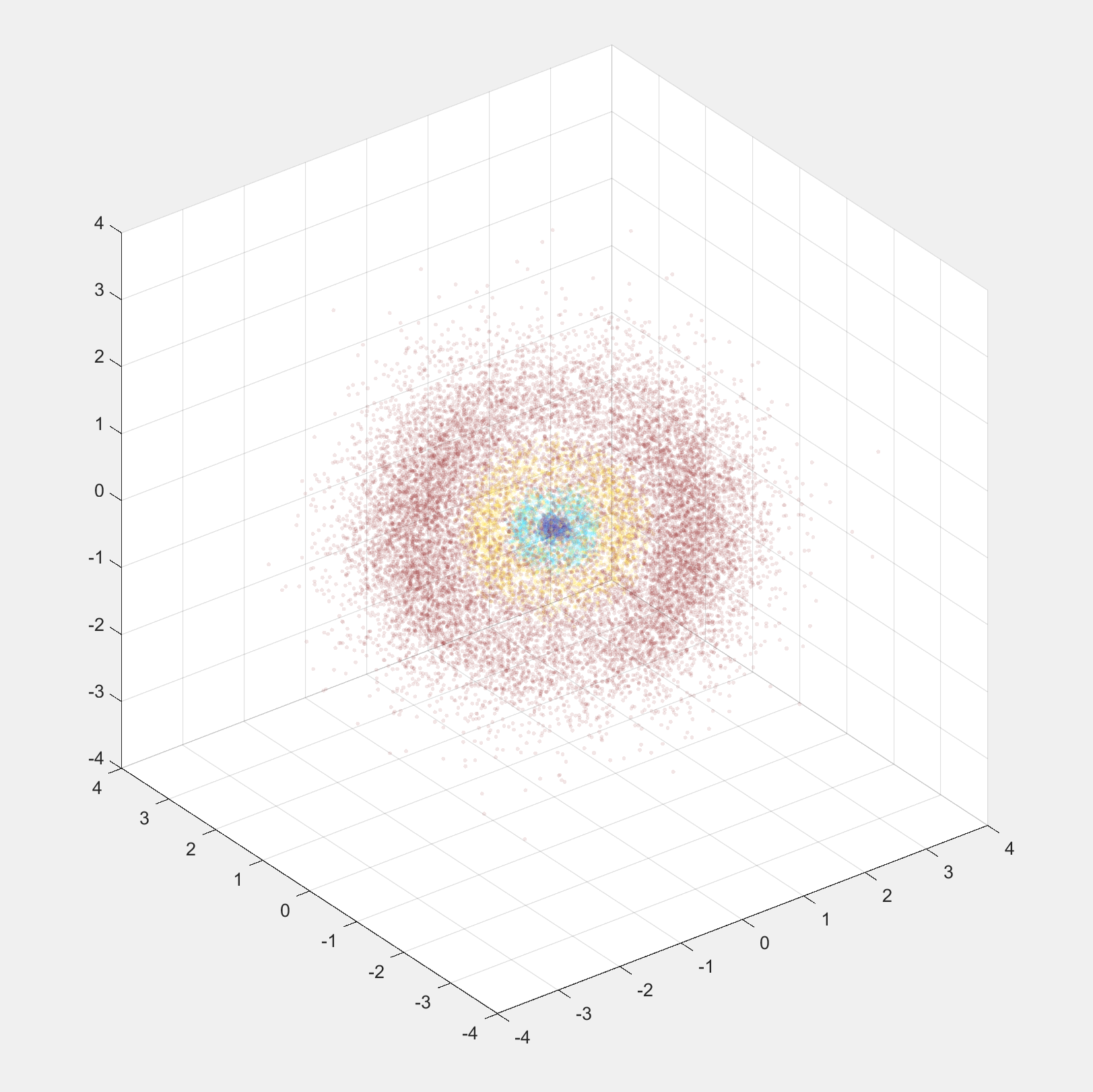
Quantum Numbers: n=5, l=1, m_l=1
Project Description
This project runs in MATLAB and generates a simulated plot of an electron in a hydrogen atom. Starting with the spherical solutions to the Schroedinger equation, it generates histograms for each axis using Monte-Carlo methods. Then it applies these histograms to get a random sampling of values which it then converts to a color-coded cartesian scatter plot.
If you are unfamiliar with quantum mechanics, an electron's position in an atom is defined by a probability function that is dependent on various properties such as energy and angular momentum. A specific set of these properties, which are called quantum numbers, is called a quantum state. In this program, you set these quantum numbers and generate a scatter plot where the higher the density of dots, the higher probability that you would detection an electron there.
Development
This project is one of many side projects I worked on during my modern physics class in the Fall quarter of 2022 As we learned about different solutions to the schroedinger equation, I wanted to get a better visual understanding, so I created animations of the wavefunctions. When we moved onto 3 dimensions, I intially wanted to create an animation similar to what I did in 1 dimension, but without a 4th dimension, it is difficult to show the imaginary components of the wave functions. With some guidance from my professor, I decided to try Monte-Carlo techniques and see what kind of graph I could generate.
The first step in generating Monte-Carlo distributions is getting a probability distribution function, or PDF. In the case of a hydrogen atom, these come from the solving the spherical schroedinger equation. We derived the solutions in our class, so I new conceptually how to create them, but they involve modifying Lagrange and Laguerre polynomials, which I had to figure out by referencing online documents and some code my professor used to demonstrate in class.
Once I had the PDFs, I needed to integrate them to get cumulative distribution functions, or CDFs. Like PDFs, CDFs give you information about the probability of certain values along an axis. However, instead of telling you the probability of a single point, they tell you the probability for a range of values. Also, due to its construction, it's slope is proportional to the probability of a single point. This comes in handy since you can take an even distribution of random y-values and convert them into x-values using the CDF and it creates a histogram that matches the shape of the original PDF. Of course, since random numbers are involved you need a large sample size, so I used around 20,000. I have code to plot these histograms, but I hid it once I moved on to using the histogram data for simulating electron detections.
The whole reason to have data like this is to pick random values from it and plot those points. MATLAB doesn't have random number generation based off of a function, so instead I have to use this method to generate the random numbers that would correlate to the solutions of the schroedinger equation.
When I got to this point, I was really excited since I finally got to see an effective 3d graph. We looked at some in class, but they were mostly opaque, which prevented us from actually seeing the inner complexity. To make them even easier to view, I color-coded the different peaks in the radial PDF since they were the most likely to overlap. This actually took a while, since I needed to numerically find the local maximums and minumums to accurately separate the groups. It turns out that the functions are too complicated for MATLAB to solve automatically.

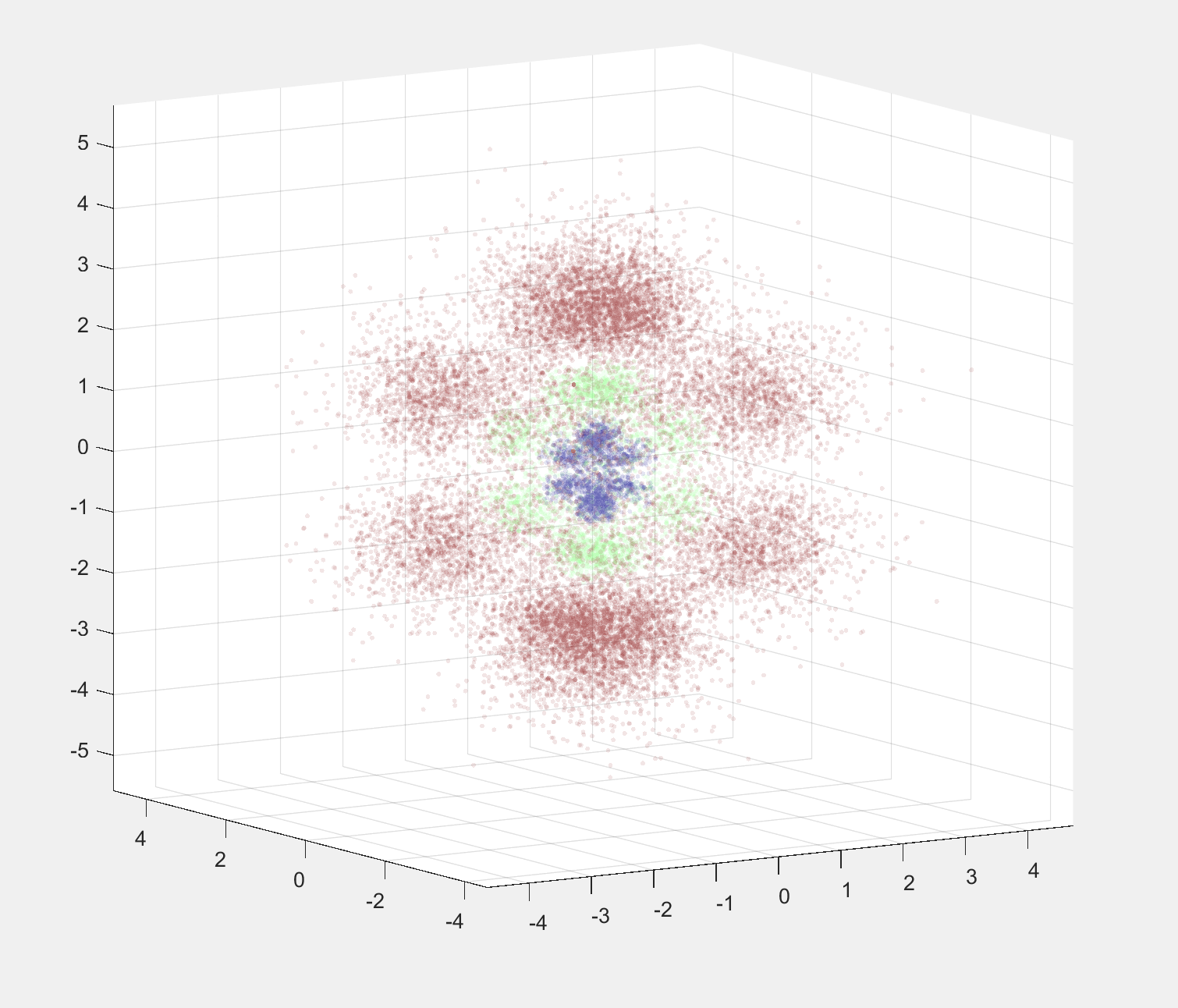
Quantum Numbers: n=6, l=3, m_l=0
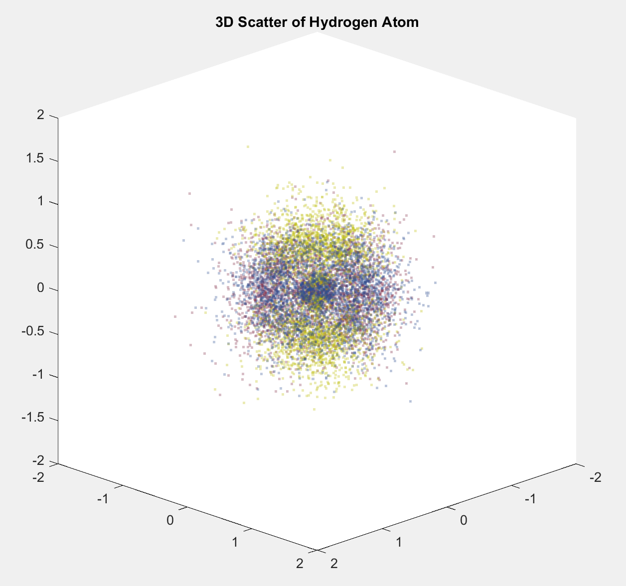
I could I have called the project finished here, but my professor had a suggestion that I thought was pretty interesting: what if we plotted different states on top of each other? This wasn't a very difficult modification to the code, but it did require me move to another file so that could keep the functionality separate. With this I also changed the color coding to instead refer to the different states rather than the groups I initially picked. The combined plot turned out to be pretty messy and hard to decipher, but the separate plots are an interesting comparision in how the direction of angular momentum changes the probability function.

Quantum Numbers: Red(n=6, l=3, m_l=-1), Yellow(n=6, l=3, m_l=0), Blue(n=6, l=3, m_l=1)

Quantum Numbers: Red(n=6, l=3, m_l=-1), Yellow(n=6, l=3, m_l=0), Blue(n=6, l=3, m_l=1)
Run It Yourself
If you would like to run this script yourself, clone
the repository and
open the folder in MATLAB. the hydrogen_atom_garrett_kunkler.m file will output a single quantum state,
while multiple_hydrogen_atoms_garrett_kunkler.m will combine multiple m_l values into one plot.
